Overview
What it does
Observability is about seeing the network as it is right now and tracking how it has behaved over time. Every DHCP transaction the appliance inspects is recorded, so the same data feeds a live operator dashboard, a per-device history, and aggregate statistics. You move from a wall-display overview down to a single device and back without leaving the appliance.
The dashboards and reports here are deterministic: they describe what the DHCP traffic actually did. Optional model-produced risk scores can appear alongside this data when you configure an LLM backend, but the observability surfaces below stand on their own without one.
Dashboards & NOC display
Live operator dashboards and a wall display
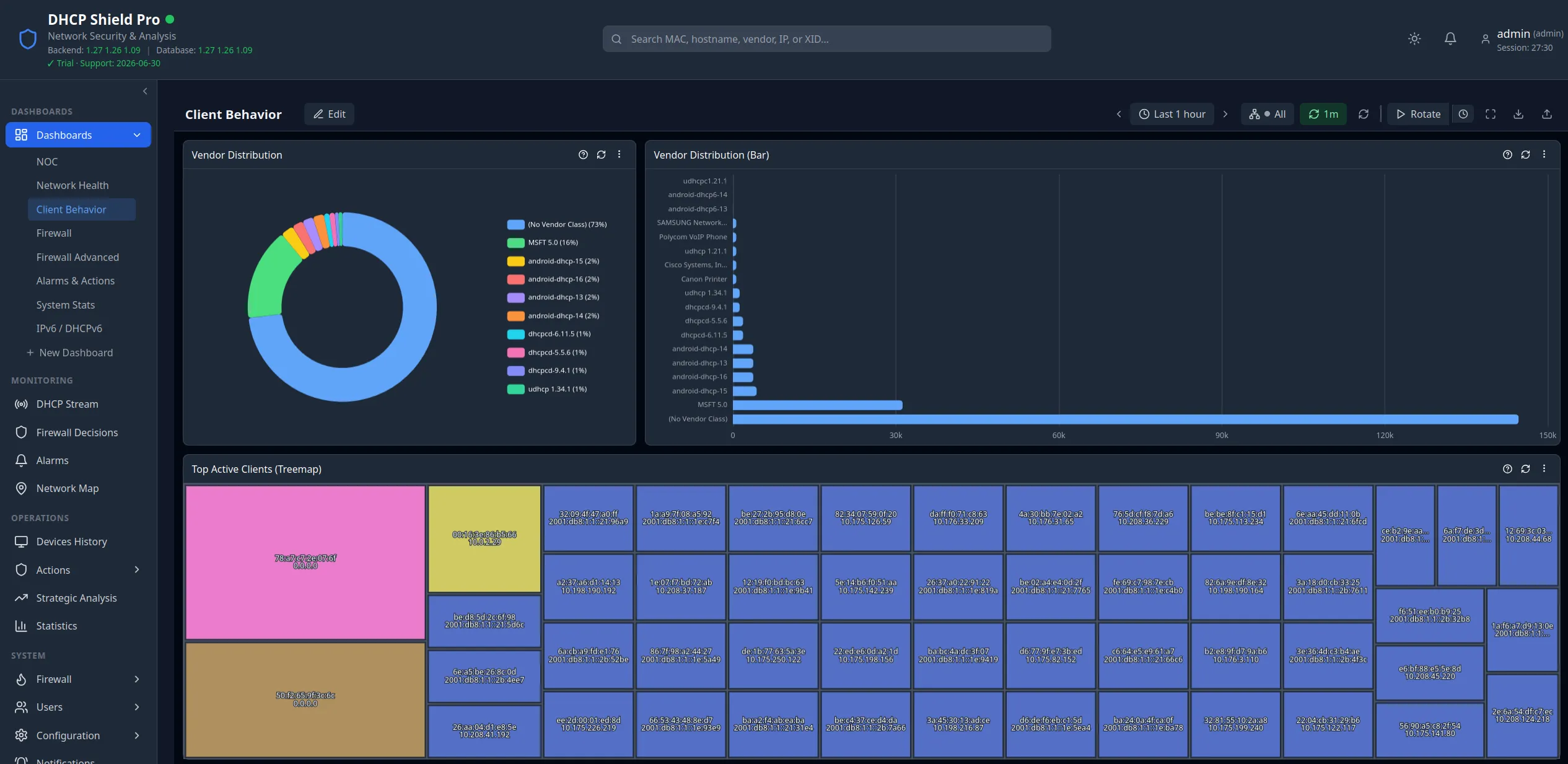
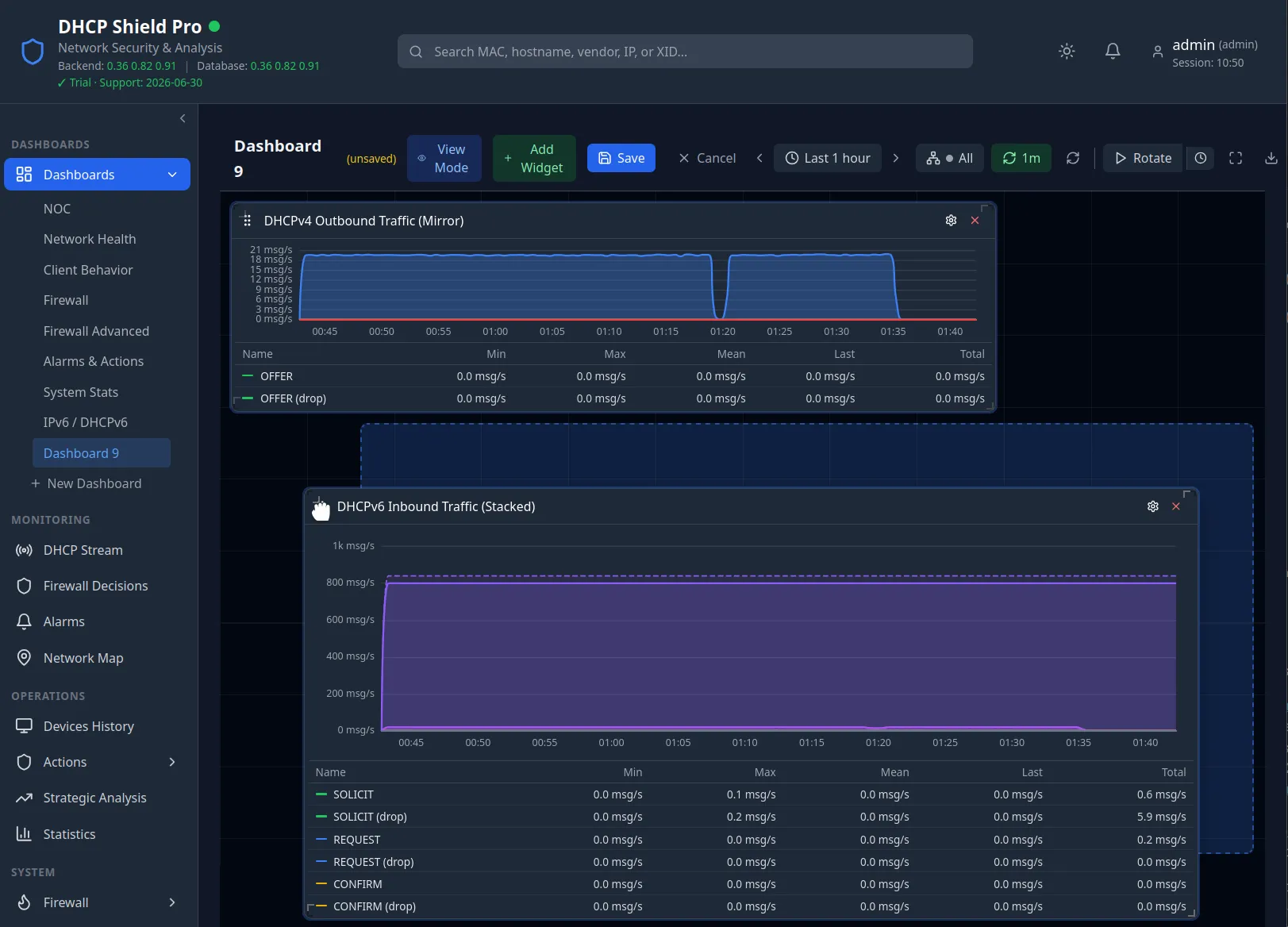
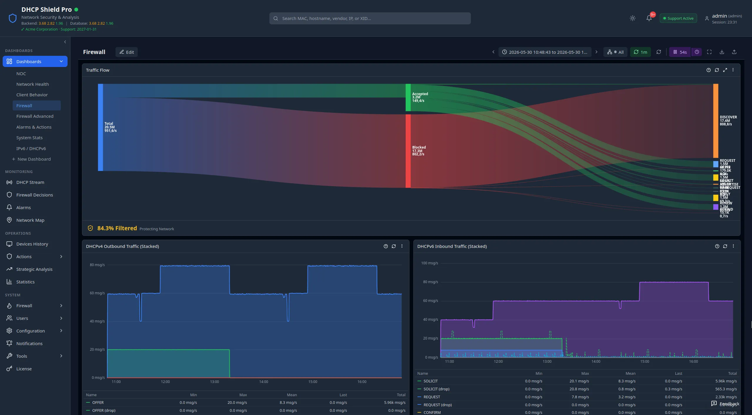
Dashboards are built from configurable widget panels covering network health, DHCP message rates by type, firewall load and dropped packets, client behaviour, pool utilisation, automation alarms, and IPv6/DHCPv6 activity. Every dashboard is per-user and saved automatically, you can build as many as you want, and a protocol selector scopes any dashboard to DHCPv4, DHCPv6, or both. A shared time-range picker drives every widget on the page.
The same dashboards drive the NOC Display — a full-screen, low-chrome wall view for the operations room. It rotates through your saved dashboards on a configurable timer, runs in kiosk mode with the screen kept awake, and visually escalates the page border when alert counts climb. The benefit is one screen the room can read at a glance, built from the dashboards operators already use.
Device inventory & history
A living inventory of every device, and its full history
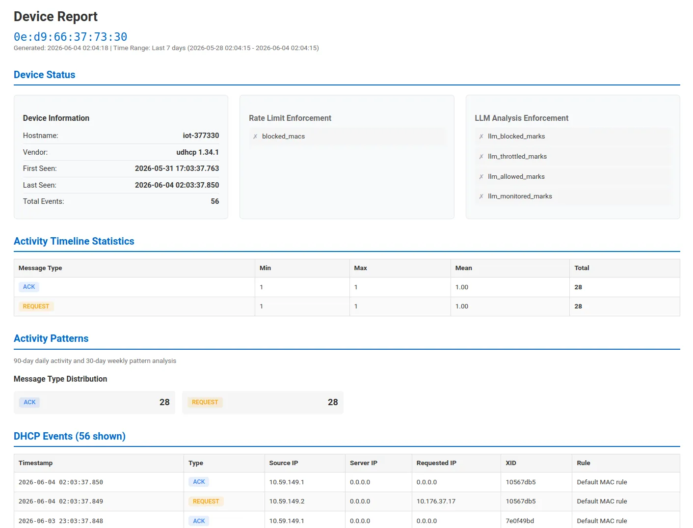
Devices History is the complete record of DHCP events the appliance has observed. You browse, search, and filter every device — by MAC, hostname, vendor class, IP or subnet, transaction ID, message type, or protocol — with full Option 82 relay-agent detail and the DHCPv6 fields (DUID, IA addresses, delegated prefixes) on expanded rows.
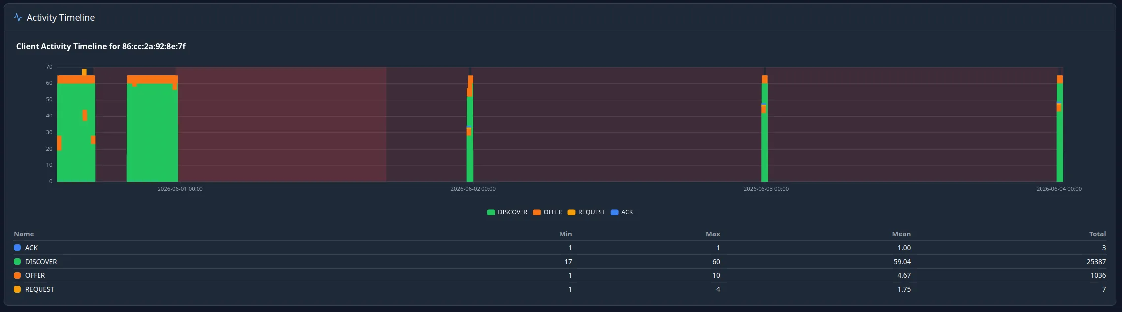
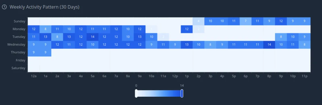
From any device you open Device Details: identity, first/last seen, assigned IPv4 and IPv6, current enforcement state, an activity timeline by message type, and long-term activity heatmaps — a 90-day calendar and a 30-day day-of-week × hour punch card that reveal a device's normal rhythm. The benefit is a single page that tells you what a device is, what it has been doing, and whether that behaviour is consistent over time.
Statistics
Aggregate statistics over the retention window
The Statistics page slices the event store without writing a query. The Overview tab ships four pre-built tables — top active clients, vendor distribution, DHCP pool utilisation with full address counts, and a request-frequency histogram — each with sorting, pagination, and CSV export. The Custom Reports tab adds a visual report builder: group by MAC, DUID, protocol, vendor class, relay, hostname, or matched rule; pick metrics; set a time window; and save the report to rerun on demand. The benefit is a tabular answer to almost any "who, how many, which pool" question, ready to export.
Flow visualizer
See accepted vs dropped traffic, and the kernel path
Two complementary views show what the firewall is doing to your traffic. A Traffic Flow (Sankey) dashboard widget shows total DHCP traffic split into accepted and dropped, broken down by message type — the clearest single picture of accept-versus-enforce. The Flow Visualizer page then renders the live kernel packet pipeline itself — hooks, chains, sets, and live packet/byte counters — as a left-to-right diagram, so you can walk a packet from entry to exit and see exactly where it is dropped. Together they turn "why was this packet dropped?" from a log search into a picture.
Network map
Devices on a map, with a replayable timeline (beta)
The Network Map plots every located device on a geographic map, coloured by status — blocked, throttled, tracked, monitored, or healthy. Zoom out for clustered donut markers that summarise a hotspot's status mix; zoom in for individual markers; click one for a device panel that jumps straight to Device Details. A historical timeline mode lets you replay device status for any past date and hour.
This one is still in beta: it needs a third-party system integrated to resolve where each device physically sits, so until that location source is connected there is nothing to plot. The map tiles themselves are served from your own infrastructure, so browsing the map sends no device data off the network.
Compliance exports
Export device history and records
Records leave the appliance as CSV. Devices History exports every filtered event with full field detail, including all the DHCPv6 fields, streamed directly from the database so large exports start immediately. Device Details exports a single device's events, or a formatted printable report covering its status, activity, actions, and history. Statistics tables and saved reports export their results the same way. These exports give you the repeatable, off-appliance records that compliance and audit reviews ask for.
From overview to one device
How it fits together
- 1
Every inspected DHCP transaction is recorded on the appliance, feeding all of the views below from one source.
- 2
Dashboards and the NOC display give the live, minute-resolution overview — on a desk or on a wall.
- 3
Statistics and the network map let you pivot the same data by device, vendor, pool, relay, status, or location.
- 4
Devices History and Device Details drill all the way down to one device's full event history and behaviour over time.
- 5
CSV and printable exports take any of it off the appliance — for compliance, audit, or an offline record.
Keep reading